The ease and speed with which you can create stacks of materials in Learning Toolbox and share them with others is something that many users cherish. This is one of the reasons why design and formatting choices in Learning Toolbox are kept at a level where users can focus on the content and put together their stacks quickly.
If you want to polish your stacks so that they not only have the right content but also look good, then there are a number of ways of how you can achieve this. Some are very quick while others require a little more work.
Four quick wins
- Match tile image colours to the tile title bar colour
- Grey colour scheme
- Patterns
- Icons
- Colour and image design style
Three designerly ways
Check out the accompanying stack with the examples used in this help page. The stack is best viewed on your mobile phone. Just scan the QR below to open the stack.

Four quick wins
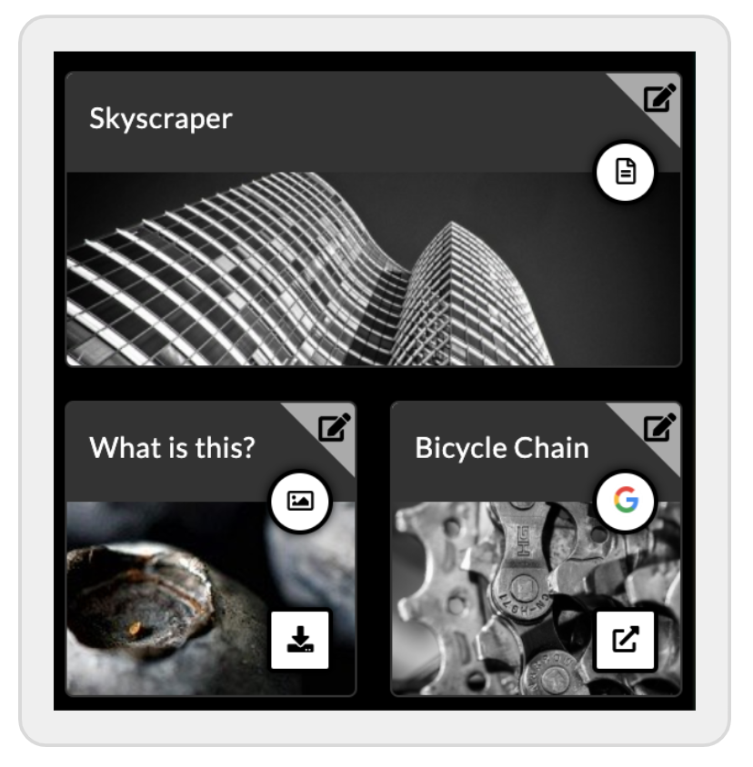
1. Match tile image colours to the tile title bar colour
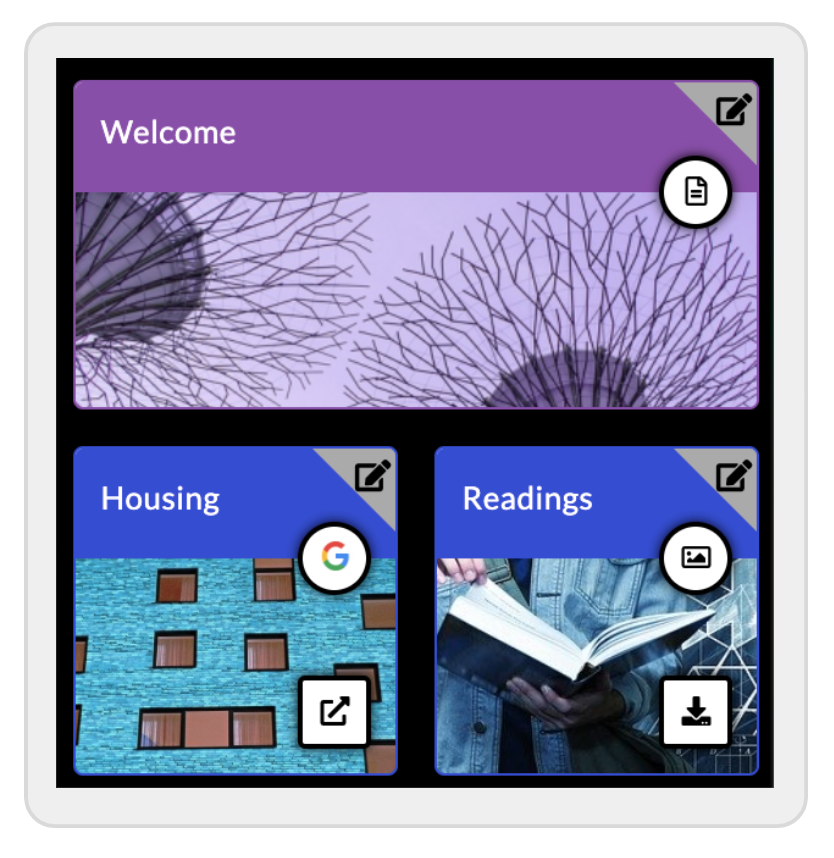
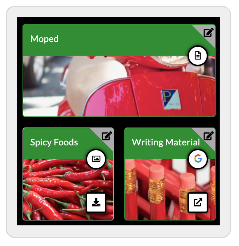
A relatively simple way to give your stack a more balanced look is to match the colour of the tile images to that of the tile title bar. For instance, if you have a tile with a green tile title bar, then you would pick an image from Pixabay that has mostly green tones.
Instead of using choosing monochromatic colours, you can also match by choosing complementary colours. There are many online tools that help you with this. See for instance this colour calculator.
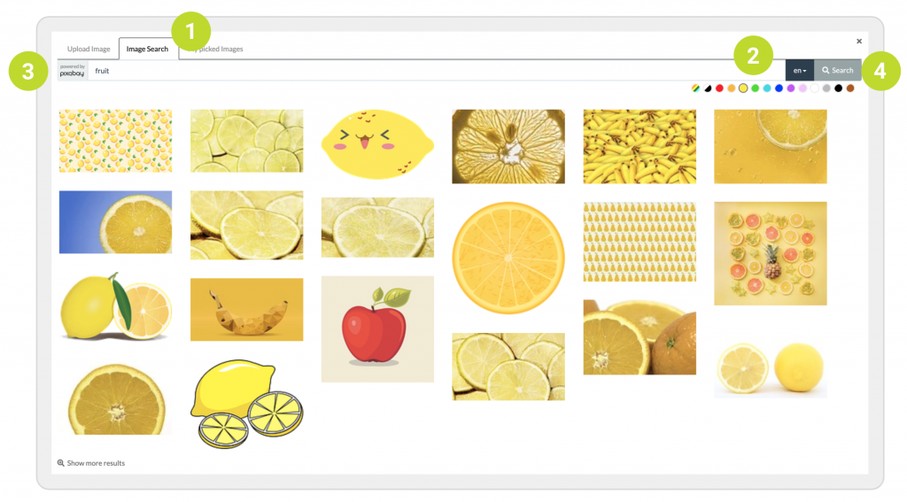
In order to choose images by colour, edit the tile, go to Layout settings, and click on Adjust image. In the image picker, in case there was already a tile image defined, click on Change image. Now click on the tab Image Search (1), pick a colour on the right of the search box (2) , introduce your search term (3) and then click on Search (4).
2. Grey colour scheme
You might also want to try out a grey colour scheme for your tiles, either for the whole stacks or just individual stack screens. You can search for grey images in the image picker by selecting grey as the search colour.
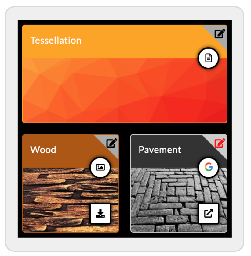
3. Patterns
Another quick way to create beautiful looking stacks is to choose patterns as your tile images. Sometimes, when you can’t find images that are contextually meaningful for some of the tiles, it might be a good idea to see whether selecting patterns instead works. It is probably a good idea not to mix pattern with other image styles, for consistency. You can of course craft your own images that are contextually meaningful for the content of your tiles, but that takes more work. You can use patterns as a gap filler, until you have the time to create your own images.
To search for patterns with the image picker, just use the search term pattern. You can also select a colour if you have a matching colour scheme in mind.
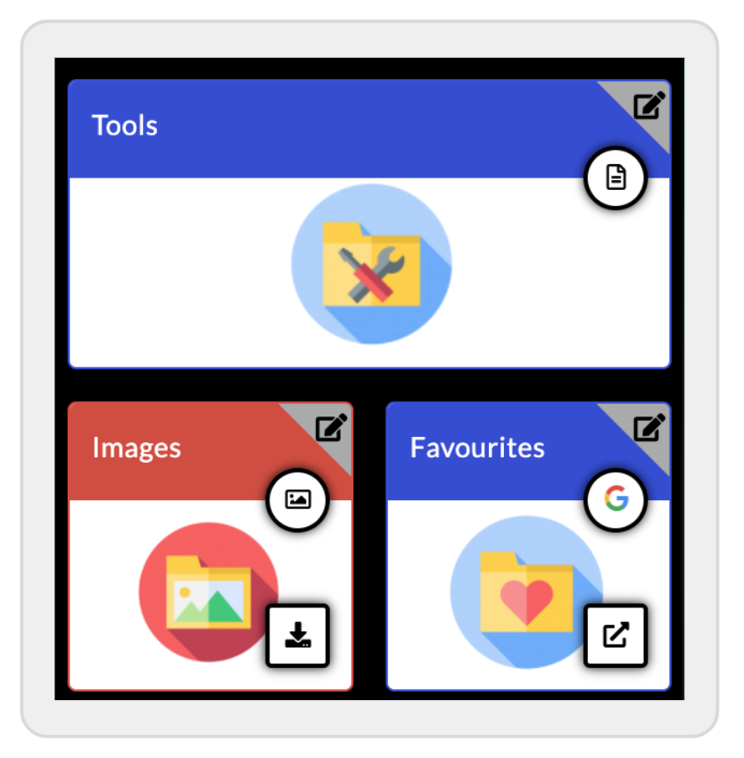
4. Icons
If you have a more functional use in mind for your stack, for instance an onboarding guide where you want to visually guide the user to the information they are looking for, you probably should give icons some thought. There are many online sites where you can get free icons.
Two things you should consider when using icons. First, you should credit the author – if the icons are free, you might be required to do so. You could do this by adding an ‘About’ tile to your stack, where you add the credit. Second, try to keep the icon style consistent. When you use an online site to get your icons, they often have icon sets for particular uses. These have a consistent design that will help you make your stack look even better.
Flaticon is one example of a great resource where you can find a lot of icons and art work for your tiles.
5. Colour and image design style
To create stacks that look good, try to use a consistent colour and image design style. Avoid mixing photos, cartoon images, Microsoft clip art (a definite no!), icons, and so on. Otherwise, the result might not be very pleasing to the eye. Also, try not to use too many colours for your tile title bars. The result can easily look unorganised and, more importantly, make it harder for your users to find their way around your stack. There are of course always exceptions and in the end you need to do what works best for you and your users.
Three designerly ways
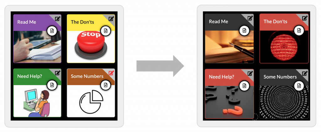
Did you know that you can completely remove the title bar of any of the tiles? This will give you a blank canvas to completely customise the look of your tiles. You can remove the title bar either by leaving the tile title field in the tile settings blank. Some tiles also have a Hide Title button that you can toggle.
Removing the title bar is in itself often just a first step in creating a tailored stack look. You might still want to have some text in the tiles that tells the user what content is behind each of them. You can also create purely icon-based tiles, where text is not necessary. In both cases, you need to design the tile images yourself and a quick way to do this is to use PowerPoint.
1. Custom tiles
You can completely customise the look of your tiles with images that you have created and that reflect best the way you want people to use your stack. Perhaps the easiest way for most people to create their own tile images is to use PowerPoint.
A quick guide to create custom tile images in PowerPoint
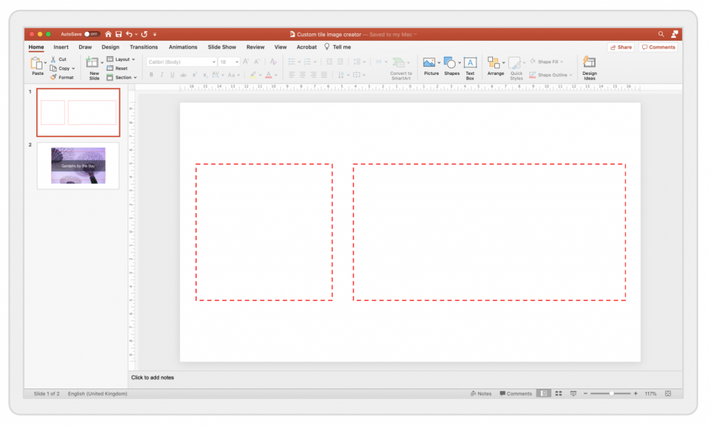
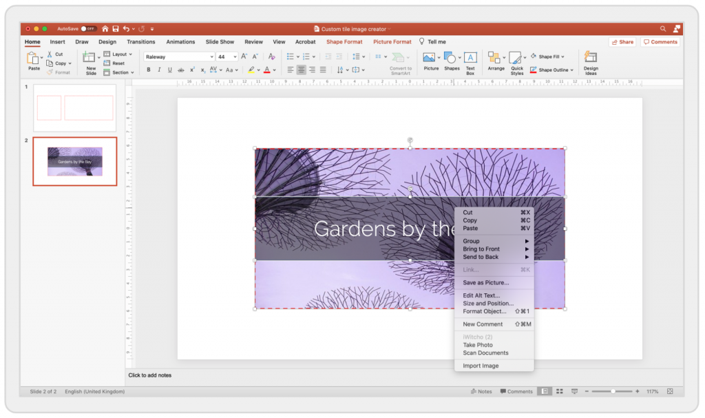
Step 1 – Create square and rectangular guides in PowerPoint
Before you start designing your tile images in PowerPoint, create a slide with the outline of a square tile and a rectangular tile (it has twice the width of the square tile). This comes in handy when you use photos and need to do some cropping.
Step 2 – Create your tile image in PowerPoint
You can now use all the features that PowerPoint offers you to create your own tile design. In the example below, we use a photo and overlay a transparent title bar.
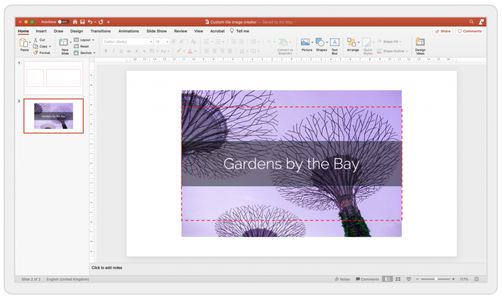
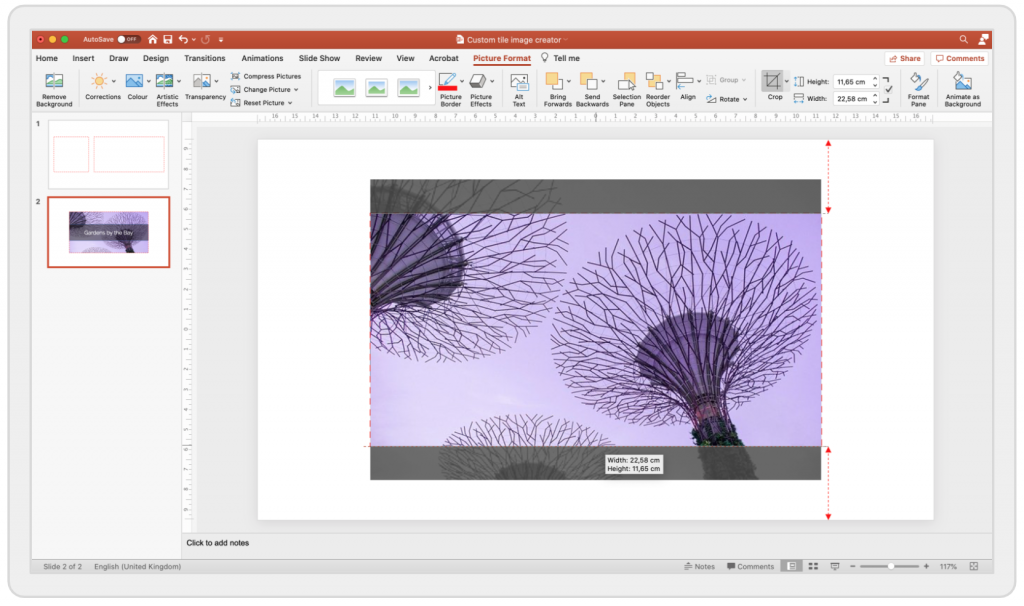
Since the photo does not have the correct rectangular format, we use the rectangular guide to help us with the cropping.
Step 3 – Save your tile image
Now that you have cropped the image, save it by selecting each element of the image and right-click, selecting Save as picture… (the right-click menu will look slightly different on Windows, but the command is als ‘Save as picture…’).
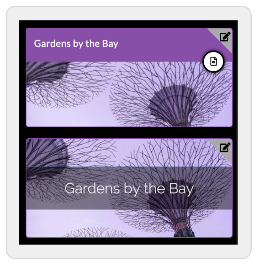
Step 4 – Upload the tile image to the tile
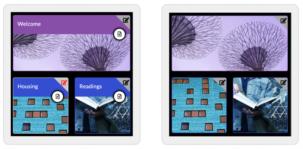
You can now upload the tile image to the tile. Below you can see the default and the custom tiles next to each other.
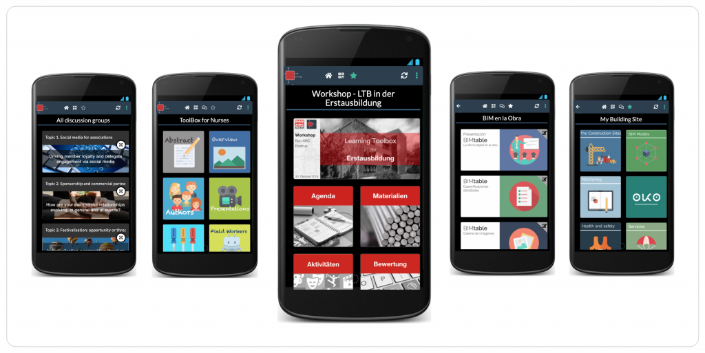
Some examples of custom stacks
Here are some examples stacks, where users have created custom images. In the stack on the left, they mixed the custom image with the standard tile title bar.
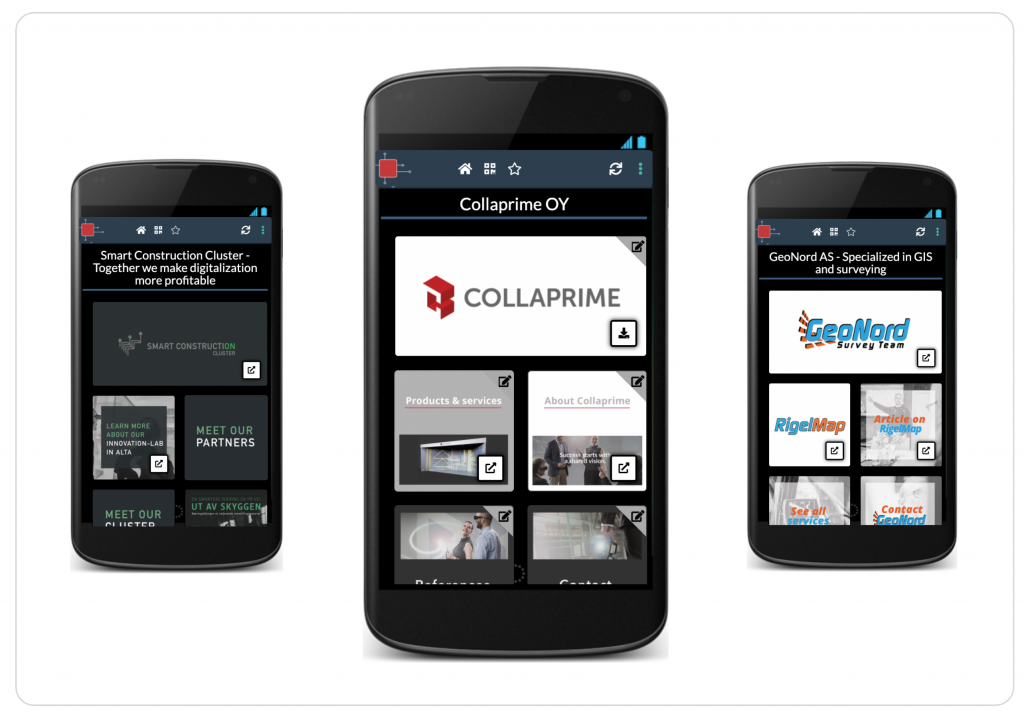
2. Branding
One important use case of custom tiles is branding. Using the complete freedom in designing the tile images they way you want, you can very easily imprint your own branding on a stack. Here are some examples of branded stacks.
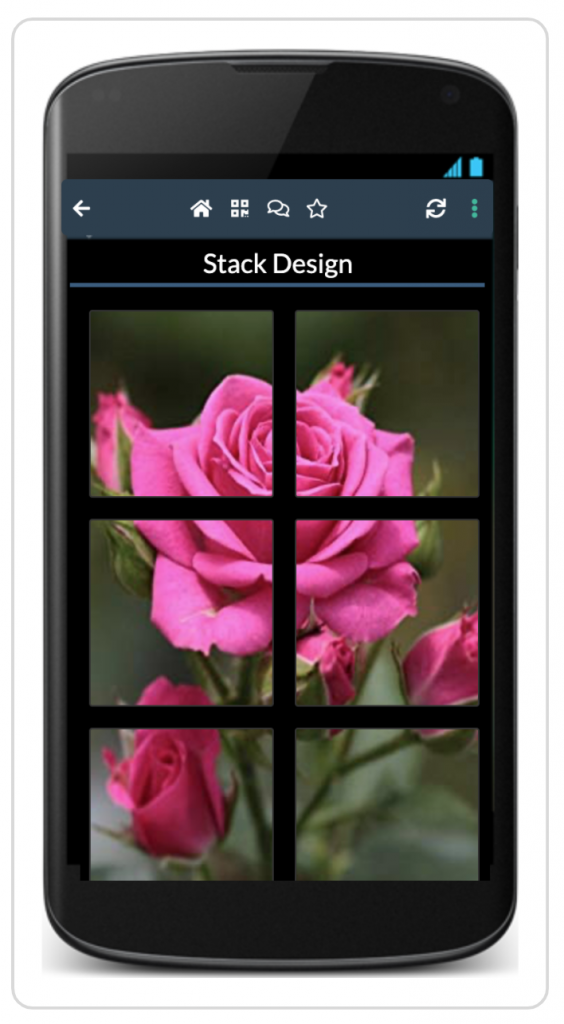
3. Photo Panels
A creative way of customising your tile images is to create a 6×2 panel using a single photo so that from a distance, the six tiles on your stack almost show like on photo.
To create a photo panel, copy your photo to PowerPoint, crop it so it has a ratio of height to width of 3:1, and then cut it into 6×2 squares. Save each as a picture and then upload them to the corresponding tiles.